Exploring MUI Components with React and TypeScript
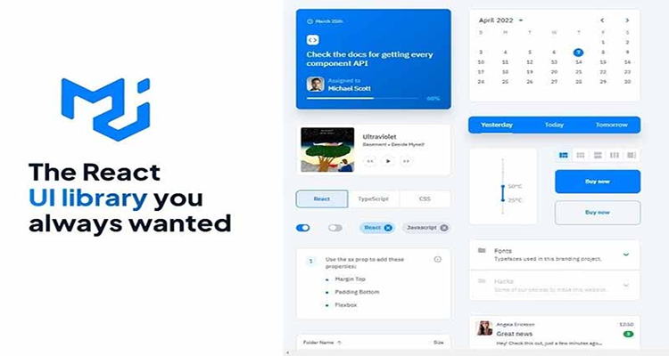
Material-UI (MUI) is a powerful library for building React applications with a modern design. In this guide, we’ll explore how to use various MUI components with React and TypeScript. We’ll cover the installation process using Yarn, and showcase practical examples of different MUI components in action.
Step 1: Setting Up Your React Project
First, let’s set up a new React project with TypeScript using Create React App and Yarn.
yarn create react-app my-mui-project --template typescript
cd my-mui-project
Step 2: Installing MUI
Next, install Material-UI (MUI) and its peer dependencies.
yarn add @mui/material @emotion/react @emotion/styledIf you want to use MUI icons, install the icons package:
yarn add @mui/icons-materialStep 3: Setting Up the Project
Let’s set up our project to use MUI components. Open your src/index.tsx file and wrap your application in the MUI ThemeProvider.
// src/index.tsx

import React from 'react';
import ReactDOM from 'react-dom';
import App from './App';
import { ThemeProvider, createTheme } from '@mui/material/styles';
import CssBaseline from '@mui/material/CssBaseline';

const theme = createTheme();

ReactDOM.render(
  <React.StrictMode>
    <ThemeProvider theme={theme}>
      <CssBaseline />
      <App />
    </ThemeProvider>
  </React.StrictMode>,
  document.getElementById('root')
);
Step 4: Using Various MUI Components
Now, let’s create and use different MUI components in our project. We’ll build a simple interface showcasing buttons, typography, a card, and a data grid.
Creating a Layout Component
First, create a layout component to structure our application.
// src/components/Layout.tsx

import React from 'react';
import { Container, AppBar, Toolbar, Typography } from '@mui/material';

const Layout: React.FC = ({ children }) => {
  return (
    <div>
      <AppBar position="static">
        <Toolbar>
          <Typography variant="h6">
            My MUI App
          </Typography>
        </Toolbar>
      </AppBar>
      <Container>
        {children}
      </Container>
    </div>
  );
};

export default Layout;
Using Button and Typography Components
Create a new file src/components/ButtonComponent.tsx to demonstrate MUI buttons and typography.
// src/components/ButtonComponent.tsx

import React from 'react';
import { Button, Typography } from '@mui/material';

const ButtonComponent: React.FC = () => {
  return (
    <div>
      <Typography variant="h4" gutterBottom>
        MUI Button Examples
      </Typography>
      <Button variant="contained" color="primary">
        Primary Button
      </Button>
      <Button variant="outlined" color="secondary" style={{ marginLeft: '10px' }}>
        Secondary Button
      </Button>
    </div>
  );
};

export default ButtonComponent;
Using Card Component
Create a new file src/components/CardComponent.tsx to demonstrate the MUI card component.
// src/components/CardComponent.tsx

import React from 'react';
import { Card, CardContent, CardActions, Button, Typography } from '@mui/material';

const CardComponent: React.FC = () => {
  return (
    <Card style={{ maxWidth: 345, margin: '20px auto' }}>
      <CardContent>
        <Typography variant="h5" component="div">
          Card Title
        </Typography>
        <Typography variant="body2" color="text.secondary">
          This is an example of a card component using Material-UI in React with TypeScript.
        </Typography>
      </CardContent>
      <CardActions>
        <Button size="small" color="primary">
          Learn More
        </Button>
      </CardActions>
    </Card>
  );
};

export default CardComponent;
Using Data Grid Component
To demonstrate the Data Grid component, install the Data Grid package:
yarn add @mui/x-data-gridCreate a new file src/components/DataGridComponent.tsx.
// src/components/DataGridComponent.tsx

import React from 'react';
import { DataGrid, GridColDef, GridRowsProp } from '@mui/x-data-grid';

const rows: GridRowsProp = [
  { id: 1, col1: 'Hello', col2: 'World' },
  { id: 2, col1: 'DataGrid', col2: 'Material-UI' },
  { id: 3, col1: 'React', col2: 'TypeScript' },
];

const columns: GridColDef[] = [
  { field: 'id', headerName: 'ID', width: 150 },
  { field: 'col1', headerName: 'Column 1', width: 150 },
  { field: 'col2', headerName: 'Column 2', width: 150 },
];

const DataGridComponent: React.FC = () => {
  return (
    <div style={{ height: 300, width: '100%' }}>
      <DataGrid rows={rows} columns={columns} />
    </div>
  );
};

export default DataGridComponent;
Step 5: Integrating Components in App
Finally, integrate these components in the App.tsx file.
// src/App.tsx

import React from 'react';
import Layout from './components/Layout';
import ButtonComponent from './components/ButtonComponent';
import CardComponent from './components/CardComponent';
import DataGridComponent from './components/DataGridComponent';

const App: React.FC = () => {
  return (
    <Layout>
      <ButtonComponent />
      <CardComponent />
      <DataGridComponent />
    </Layout>
  );
};

export default App;
Conclusion
Exploring various MUI components with React and TypeScript helps you build sophisticated and interactive user interfaces. By following this guide, you’ve learned how to install MUI using Yarn, set up your project, and integrate different MUI components into your React TypeScript project.
Additional Resources
By following this comprehensive guide on how to include various MUI components with React and TypeScript, you’ll be well-equipped to create beautiful, responsive applications. Happy coding!


